Motto
A branding agency website that practices exactly what it preaches.
Why it works
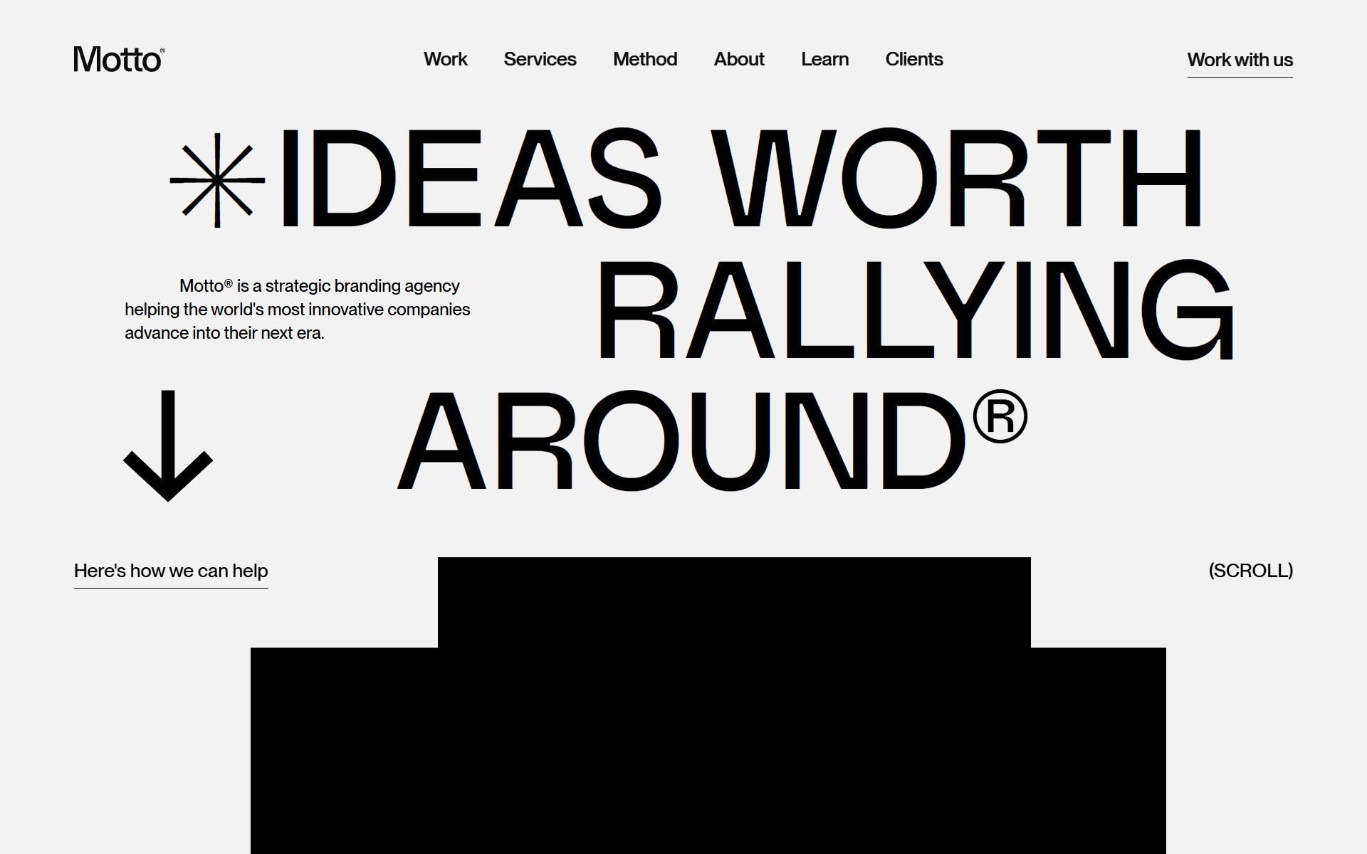
Motto uses clean white space, confident type, and a restrained palette to telegraph strategic clarity before a visitor reads a word about their services. Case study work is given room to breathe with full-width project imagery, letting Google, Disney, and Microsoft-level results do the persuading. Nothing on the page competes with the portfolio — the design is the pitch.
Who should look at this
Service businesses and agency founders who want to position around strategic outcomes rather than deliverables and hourly rates.
Signature technique
The brand name is set with a trademark symbol treated as a deliberate typographic element — a small detail that signals proprietary thinking and long-term brand investment to potential clients before any copy is read.
Like this style?
Take the style quiz to build your own shortlist, then generate a professional design brief you can hand directly to a developer — for $27.